A little background: in early 2012 I had the pleasure of chatting with Loup Cellard, Data Scientist and Digital Humanities researcher, at the time a contributor to the online magazine Strabic. Loup was interested in the evolution of urban cartography, at a time when the Attoma agency had just finalized the UX/UI design of the first “modern” version of the Vianavigo.com route search site of the Île-de-France regional transport authority, STIF, later renamed Île-de-France Mobilités.
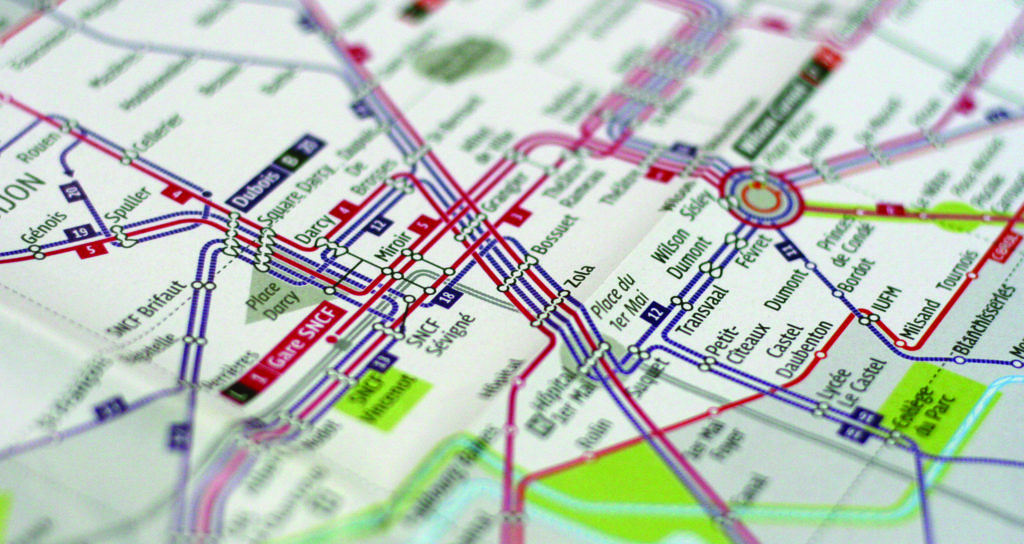
At the same time, in collaboration with the esteemed cartographic and information designer Aurélien Boyer-Moraes and our partners at the Chevalvert graphic design agency, Attoma laid down the principles for the new schematic cartography of Lyon’s TCL network, and rethought the cartographic strategy for the Divia network (Dijon). In short, the subject of cartographic representation of networks, both static and digital, was at the heart of our thinking at the time, and our conversation with Loup came at just the right moment.
This exchange gave rise to an article that we republish here, signed by Loup and Ingi Brown and posted online on Strabic magazine on May 21, 2012. The version published here has been slightly updated, notably to correct some inaccuracies and update some now obsolete links. I apologize to the authors if, in doing so, I have made a few errors of interpretation. Exegetes can consult the original publication here.
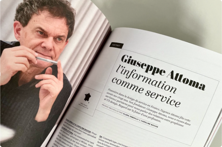
Giuseppe Attoma Pepe
While geographers map the real world with an imperative of accuracy, the maps that structure our experience of the city are full of discrepancies, shortcuts, and multiple paths. Attoma, a pioneering information design agency in France, is rethinking the ways in which we visualize transportation networks in the country. This article is based on a conversation with Giuseppe Attoma Pepe, founder and director of the eponymous agency.
Attoma: Information as Material for Representing Mobility Offerings
From its early projects, Attoma has been interested in information design, where the need to organize complexity is paramount, as in the field of financial information, for example. Applying design to information makes it possible to perceive flows and masses of data with a humanist aim: to hierarchize information so that it is accessible to all.
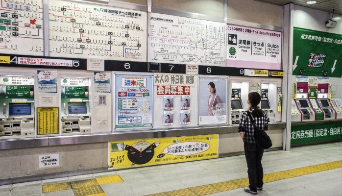
Attoma quickly became passionate about the concept of urban mobility, working on various projects around the representation of mobility capabilities for authorities and public transport operators. IIn this perspective, the agency created the RATP Navigo TVMs (Ticket Vending Machines) UX/UI Design (2001-2007), and in 2011, SNCF R&D called on Attoma to develop a carpooling service and its mobile application. Attoma has also designed the passenger information systems for the Lyon (TCL) and Dijon (Divia) urban networks.
The Transport Map: The Legacy of the London Model
In 1933, industrial designer Harry Beck developed the first symbolic cartography of an underground network, that of London. As this network is precisely underground, Beck’s innovation consists in abandoning the geographical positions of the stations in favor of the network’s own topology. He develops a map that looks more like an electrical schematic than a traditional geographical map.
This mode of representation quickly became a huge success, thanks in particular to its legibility, and has since served as the canvas for the majority of mobility network representations worldwide. And yet this model is now showing its limitations. Indeed, in the case of the London Underground, in an attempt to relieve congestion on the saturated network, walking distance indications are added between stations that are physically close but distant on the map. Today, we’re faced with hybrid maps that are part geographical representation, part symbolic scheme.
Today, we are therefore faced with hybrid maps between geographical representation and schematic diagrams. The representation of the network is rationalized (simplified graphics, logos and pictograms without frills, limited colors, etc.) but it indicates more than just a direction, i.e. the overall range of services offered by the operator.
Transport for London (TFL) has even embarked on a pedestrian education initiative, with projects such as Legible London, which offers maps of pedestrian routes in London, and “totems” showing the walking time between different points of interest in the city. These totems then become the new “stations” of the walk. With Legible London, the city’s potential is opened up to pedestrians. And these new terminals extend the underground transport offer to the surface.
In this way, TFL multiplies the relays and means of access to mobility information; these signs are the materialization of the different travel options offered by the interactive map of the network. On this same map, bus, metro, tram networks, access to each station, train schedules and any other complementary information appear at each stop.
Another particularity that can confuse tourists accustomed to the Paris metro maps is the spider maps used in London. These are maps redesigned at each metro station, where the network map is reconfigured to put the station at the center.
We are skeptical cartographers
Faced with new mobility challenges, an intelligent and intelligible map must organize the different service offers, forgetting the geographical reference in favor of the user’s need. Giuseppe Attoma readily speaks of “the end of the map”! It is therefore a question of symbolizing the potential for journeys in the city
It is precisely in these intersections that the Attoma agency has developed its expertise, by analyzing the paradoxes of the use of maps today. Its studies show, for example, that transport network maps are increasingly used as the only city maps by tourists. They are no longer satisfactory in terms of today’s uses: the schematic map of a bus network does not allow you to understand the city. And, faced with increasingly diversified usage projects, a single map no longer satisfies users, whether they are regular users or newcomers.
In addition, the media that support these representations are constantly evolving; the omnipresent smartphone cannot be ignored when it comes to accessing the map.
Facilitating access to the subjectivity of the map
Attoma’s most recent projects have focused on the concept of a roadmap, based on the idea of a “personalized mobility recipe”. It is no longer about offering the same representation, a single monolithic map to all users,but about defining criteria that allow each person to ask the information system to determine suitable routes. The new forms of mobility represented are rather part of a range logic. Each needs its representation.
The map is a tool that represents a territory of action Attoma’s experiments seek to explore maps that are no longer limited to representing network topologies but that invest in the notion of “quality of service”. For example, in the project for the TCL (Transports en commun de l’agglomération de Lyon) where the networks are undergoing major changes, the maps highlight the high-level service bus lines (running on dedicated lanes, at higher frequency than other lines) to compare them to the metro lines and thus indicate to passengers the service equivalences. The map becomes more than a geographical representation of a network:a real architecture of the offer, hierarchized, making the quality of service of the network readable.
From now on, we are faced with a system of itineraries with flags to be placed on the map. Here, we can see that the mobility offer has been completely modeled on Google Maps. Walking and public transport can be considered at the same time. In addition, a set of places are mapped: post office, town hall, school, hospital, supermarket… becoming potential starting or arrival points.
The Universal Map Does Not Exist
Far from the myth of the perfect, unique, and objective map, today’s challenges in the field of mobility mapping lie in the design of diversified responses that meet the needs of users. These developments are leading to new uses and the gesture of unfolding a Michelin road map is already relegated to the memory of the past! On the contrary, as Attoma has well understood, the current trend seems to be rather towards a progressive reduction of the map window: from the old road map to the computer screen, via the mobile phone screen, our field of vision seems to be shrinking more and more. The frame becomes smaller and smaller but also more and more transportable (always more mobility) These connected maps allow real-time information on the state of the network, and the Internet multiplies the number of points of view and information.
For Giuseppe Attoma, this evolution requires thinking about the same project in different media and different places, therefore with multiple uses. For the new graphic guidelines of the Lyon network, for example, the agency called on a typographer to design an alphabet that is readable both in the urban space, on a printed leaflet and on the screen.
Maps require knowledge to be used to their full potential, which is acquired through learning by users Changes in representations are accompanied by an adaptation time that can generate frustration and misunderstanding. At the launch of the Dijon network, Attoma observed a disorientation and loss of bearings among users (caused in particular by the change in the color of the lines). It was only after several months that the offer was largely accepted by the population.
It seems that the creation of this complete mobility offer must go through the digital world. With the opening up of public data, we can hope that a multimodal service offer will emerge from public and private actors, as well as from civil society. Web 2.0’s logic of openness will lead to the creation of the city 2.0. A city open to itself, in perpetual renewal, organizing the rapid pace of flows, in line with the new uses of digital technology in the urban space.