“Graphic artists, typographers, designers, illustrators, photographers, or any other image-makers. You who have filled the pages of our 272 issues; you who have amazed us and passed on the passion of your professions; you who have read and supported us: Thank you.”
These were the words used by editor-in-chief Caroline Bouige on August 3, 2023, to announce the demise of Étapes magazine, an essential reference for graphic culture in France and the French-speaking world. Founded in 1994 by Michel Chanaud and Patrick Morin, Étapes had, over the years, earned a reputation for scouting out trends and discovering new talent. The decline of the paper magazine model coincided with a certain decline in graphic culture in France, and the two factors together ended up condemning an editorial project of the highest quality, which for almost 30 years had worked to promote graphic design and, more generally, the culture of the image in all its forms.
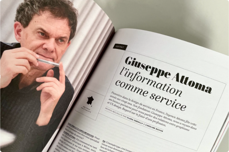
In 2017, Clara Debailly and Caroline Bouige interview Giuseppe Attoma Pepe in an article entitled L’information comme service, to mark the 20th anniversary of the Attoma agency (no. 237, May 5, 2017). This interview, from which we publish a large extract below, presents the vision of the relationship between graphic design, information design and UX design, carried by Giuseppe within the agency.
Clara Debailly and Caroline Bouige: Why and how did you specialize in service design?
Giuseppe Attoma Pepe: I started out as an art director in Milan, but very quickly became interested in information design. When information itself became interactive, I asked myself about information architecture, i.e. how to make these interaction issues multi-dimensional and navigable. At the same time, information has also become a service. With Attoma, we advocate a systemic, global approach that looks at the organization and usability of a service through different contact points. We deal with digital, spatial, paper and customer relations projects. Service design is a way of conceiving interfaces, in the broadest sense, between organizations and their customers.
CD & CB: What issues do your customers come to you with?
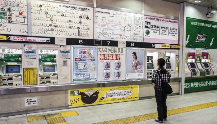
GAP: The typical example was when RATP asked us to design the interface for the Navigo terminal: they introduced a new payment platform, with a contactless transport card and a touch screen in the network, and at the same time, they closed the sales counters. It’s all about service, usability and brand. This interface must tell the RATP story. Everything I’ve just mentioned is graphic design, since it all has to be represented visually. There has to be a formal quality, hierarchical issues, everything that is part of the foundations of graphic design.
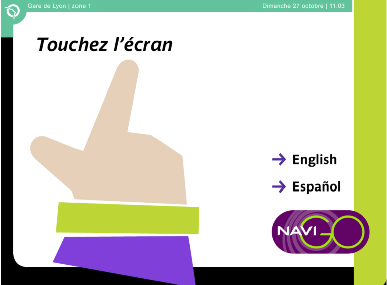
The original design of the Navigo kiosk home screen for RATP, 2002. A prefiguration of the principles of flat design (Giuseppe Attoma Pepe and Vincent Maloron).
CD & CB: Does having large-scale industrial or service structures as customers allow you to innovate, to take risks in your graphic choices, or do you prefer graphic lines to which users are already accustomed?
GAP: In France, there’s a curious opposition between the functional and the beautiful. There are some very persistent prejudices when it comes to business. Schools are more likely to train theatrical poster designers than functional document designers. In Germany, the UK and the Netherlands, even the smallest packaging, bank statement or administrative form is carefully thought out. In France, there’s still this approach linked to the culture of creation, and things need to change. To answer your question, I think it’s a question of will and intelligence to be able to introduce innovations in graphic language in constrained contexts. A customer will never say “I find this shape extravagant”, if it makes sense. The problem is knowing how to use the vocabulary of graphic design to make sense of things. When this is the case, people buy in.
There’s something about the disappearance of graphics in interaction.
CD & CB: But doesn’t the need for functionality and immediacy required by interaction design prevent you from making radical choices, as you might for a theater poster?
GAP: Yes, but they’re objects with different functions. So I don’t have to create the same emotion and commitment. Design is not art. It’s true that there’s something of the order of the disappearance of graphics in interaction. We need to create a convergence of interaction patterns. Let’s say you’re designing a search engine, you’re not going to reinvent the input field, and the same goes for a shopping cart on a website. You’re going to use existing patterns, because it’s a language that makes sense, that people have learned, it’s their frame of reference.
A good designer knows how to manipulate this vocabulary and make the interface efficient, functional and satisfying. This doesn’t mean we can’t introduce innovation and highlights. But, yes, the basic vocabulary may seem more modest, we’re back to basics. Flat design, for example, is an elementary language, but one that can be interesting and subtle in its own right. Interaction design is an almost cinematic, non-static language.
The notion of experience goes beyond the question of the sign, combining all semantic objects.
CD & CB: What’s your take on flat design? Do you think it’s the answer to everything?
GAP: There’s a bit of that. When the first iPhone arrived on the market, Apple adopted a skeuomorphic graphic vocabulary, simulating shapes and materials in a hyper-realistic way. It was very clever, because the user had to find a continuity of meaning, be able to recognize things and know what they were for. Then, when responsive design came along, we had to design elastic shapes that could adapt to all media. This led designers to work with vector objects rather than images. At the same time, the question of learning and pattern recognition became obsolete, since it was an acquired language. This led to a simplification of signs and shapes, giving rise to flat design. The emerging trend is the return of text. After a wave of pictograms, we’re now putting the emphasis on the word, to the detriment of the sign. The notion of experience goes beyond the question of the sign, combining all semantic objects. That’s why design includes all these dimensions, and integrates complexity into the project. But schools aren’t quite up to speed on this yet.
CD & CB: Precisely where do the UX designers who work with you come from? What are their backgrounds?
GAP: There have been several generations. Some came from ENSCI, others from Strate, and some have engineering backgrounds. There are also many profiles from the humanities and social sciences, as we have a well-developed research cluster.
CD & CB: What makes a good UX designer, in your opinion?
GAP: This may come as a shock to you, but in my opinion, a good UX designer doesn’t necessarily have graphic design skills. That said, at Attoma, most of our UX people have a background in graphic design. What makes a good UX designer is his or her understanding of usage, his or her ability to project and envision a kinematics in relation to a need. We’re closer to storytelling than to the object. You could call it narrative design.
CD & CB: At what stage of the project does it come into play? How does he work with graphic designers?
GAP: At our company, we work with UX designers as quickly as possible, in eco-design workshops, where they actively collaborate with customers and experts, depending on the project. We make an initial sketch of key screens and situations. During this phase, graphic designers are not necessarily involved. Once we’re on the right track, we create clickable models to give you an idea of the route. We’re particularly attentive to functional branding, which makes it possible to understand that the experience is linked to a given brand. This means identifying the customer’s fundamentals and vocabulary, and finding a way to interpret them accurately through the experience.
The designer’s job is no longer the object, the form, the sign, but the relationship…
CD & CB: Are there any graphic solutions that are known to be more efficient and simpler, particularly with regard to new interfaces?
GAP: Yes, absolutely. In typography, for example, there are certain constants. If we take the case of signage, it will always be a typeface with a wide open eye for legibility, that doesn’t hunt too much, with optimized line spacing. The constraints of perception and use influence our graphic choices. Is this a limiting factor? No. The spectrum of possibilities remains immense, because these signs are associated with technical behaviors in interfaces. The result is a multiplicity of combinations. Hence the importance of creating a clickable model as soon as possible. It wouldn’t make sense to show our customers a static mock-up, because that’s not what creates the experience. I’ve never had the impression that our possibilities were limited. But I have to say, we’re not known for our “wow” factor in graphic design (laughs).
CD & CB: Are there any projects that leave more room for more poetic, aesthetic forays?
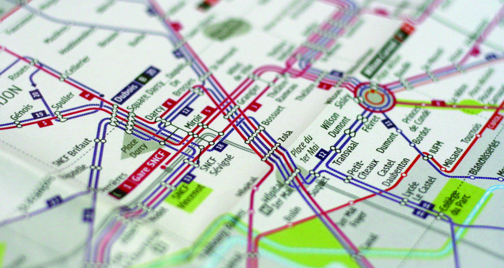
GAP: The seductive side is still there. Over time, our interest has developed towards issues of use in industry and mobility – rather than towards industries such as luxury or culture – because that’s where there are things to do today. We inject the aesthetic, seductive aspect into the quality of the experience, the emotion it arouses. We’re moving beyond pure functionality, particularly in the mobility sector where we need to appeal to the user. Mobility issues are truly fascinating. For some years now, I’ve been in charge of the Design Commission for the International Association of Public Transport (UITP), based in Brussels, and we’ve been organizing training courses on information design, enabling us to see the evolution of design projects in this field all over the world. In my opinion, mobility is a new cultural territory.
CD & CB: What do you see as the challenges for UX design in the years to come?
GAP: The disappearance of interfaces, due to the intelligence in the objects created, leading to a simplification of language. Tomorrow’s subject will no longer be the screen, but the service itself. On the other hand, we’re moving towards design automation. Designers will increasingly be called upon to design prototyping and mock-up generators, and to propose ready-made solutions. We’ve already seen this with WordPress templates, for example, which are very popular with users. In my opinion, the designer’s job is no longer the object, the form, the sign, but the relationship.